
April 2019: A Sight to Behold
Howdy! It’s that time again. You guys want news, you want info, you just want to know what’s going on? We’ve got you covered c:
Before we begin, I just want to give a quick disclaimer way up here. Nothing you see in this blog is final. Everything is either work-in-progress, concepts, or just brainstorming products that are likely to change. We’re opening the doors a bit to show you what we’ve been up to and some of the processes we’ve been going through, but that doesn’t mean anything here is done, or set in stone by any means.
A Quick Recap
There’s been a lot of smaller chunks of news being spread around lately, so I figured we’d start of by gathering it all in one place in case you missed any of it.
As we’re sure you’ve likely already heard, Online Multiplayer is coming to CH. We’re not quite ready to talk more details about online just yet, but you’ll be seeing some interesting things coming very soon in regards to it!
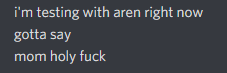
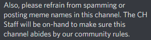
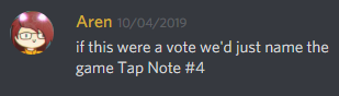
On another note (no pun intended), those of you who frequent the official CH Discord may have noticed some interesting activity earlier this month. The #pnh-name-suggestions channel appeared for a brief time, giving the community a chance to help participate in a group brainstorming session. With the future of the game’s name at stake, there was no shortage of memes, jokes, and inappropriate answers. However, there were also a lot of really good ideas, and the channel definitely helped us figure out the direction we wanted to take the future of the game’s name and presentation!
Out With the Old, In With the New
As we discussed earlier in the quick recap, a name change has come to the future of PNH. It was an unfortunate event that our previous name chosen earlier in PNH’s development was no longer available to us. After a multi-hour brainstorming session internally where we came up with a few usable names, we took to the public CH server to open up our brainstorming sessions to the masses.
Memes and jokes aside, the community brainstorming session was actually very helpful to us!
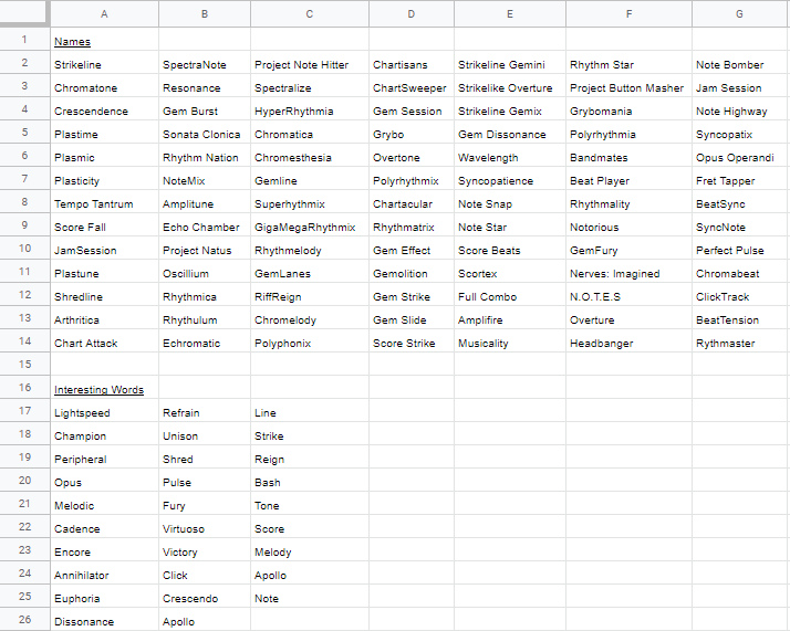
Previous to that channel’s life, we had a few decent ideas floating around internally, but having that channel open really gave us some more ideas and inspiration to work with. At the end of it all, we ended up going with a quite popular option…
As such, we’ve decided to announce to you all the new name of the game.
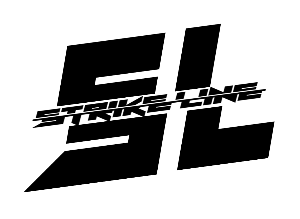
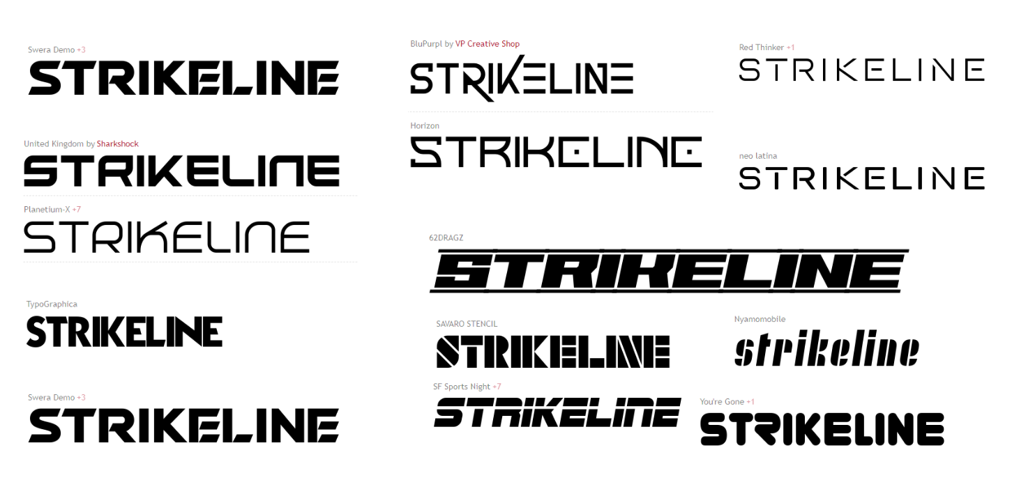
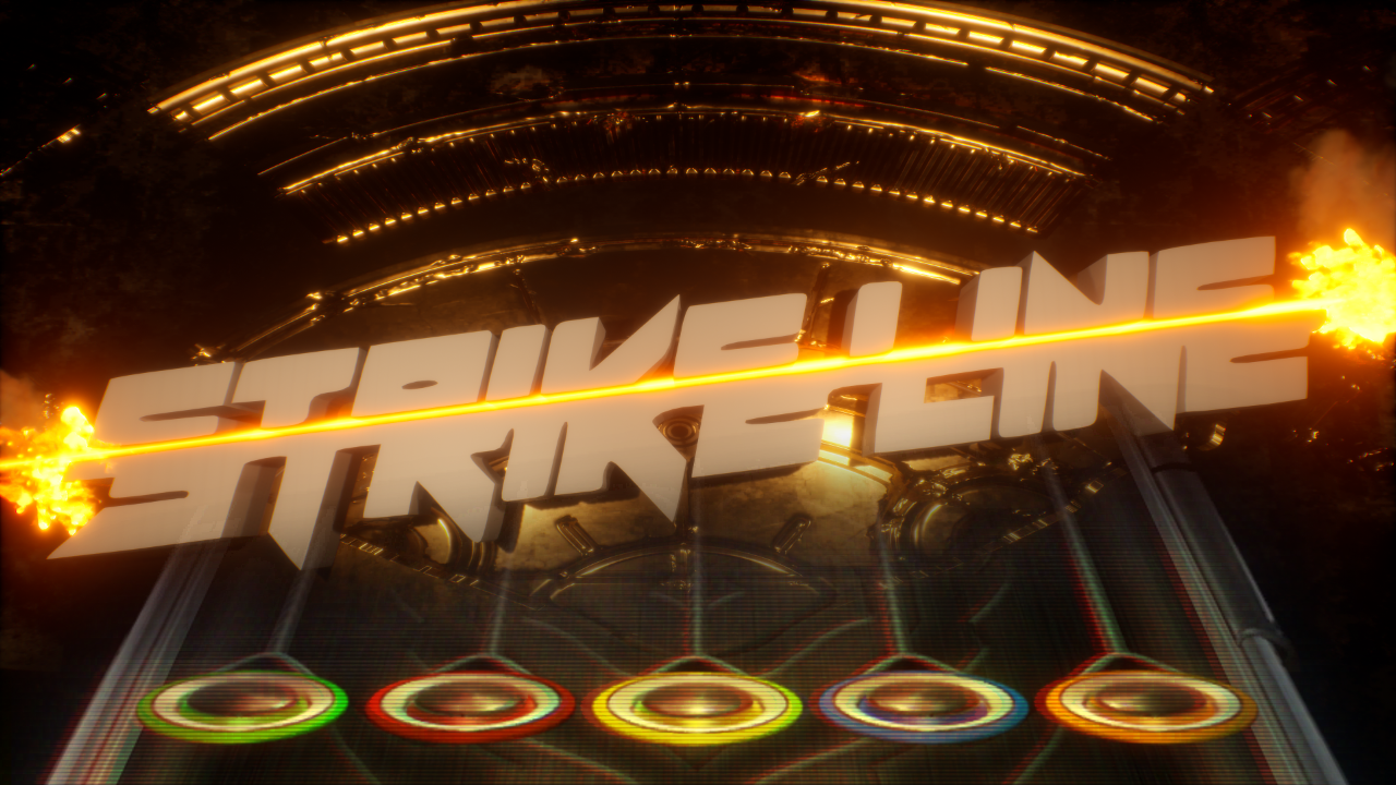
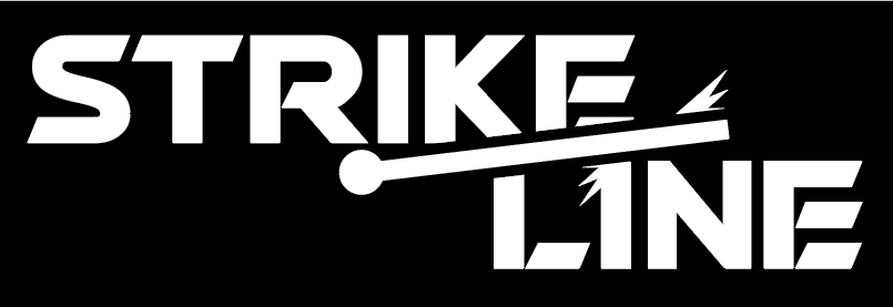
Introducing: StrikeLine
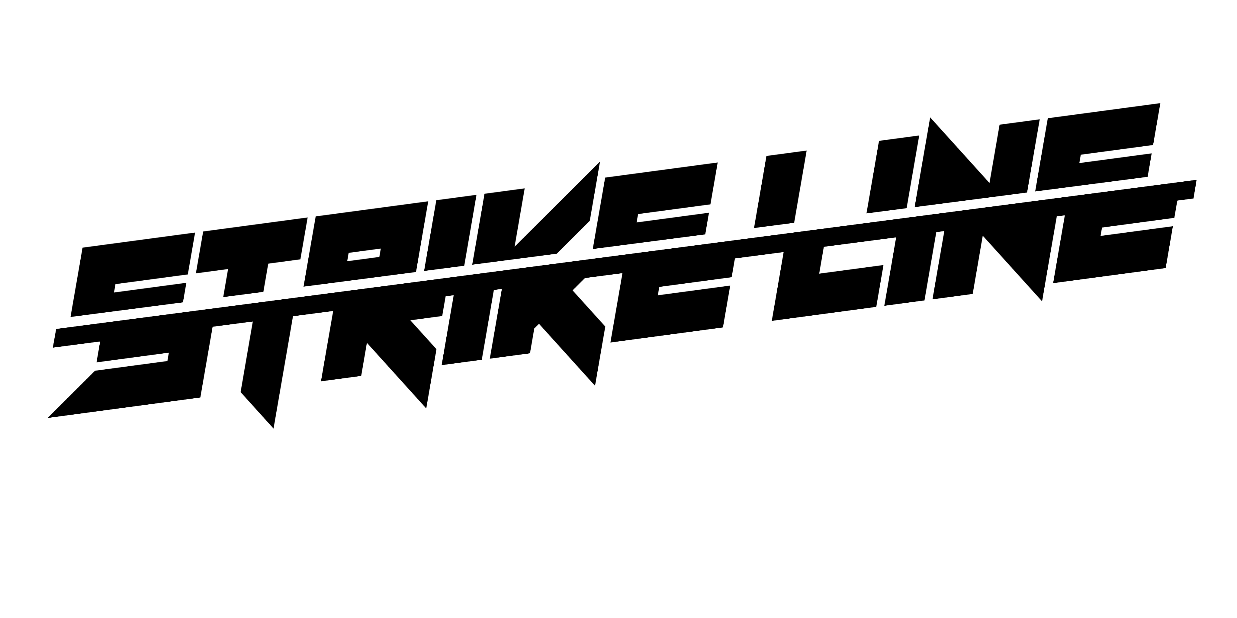
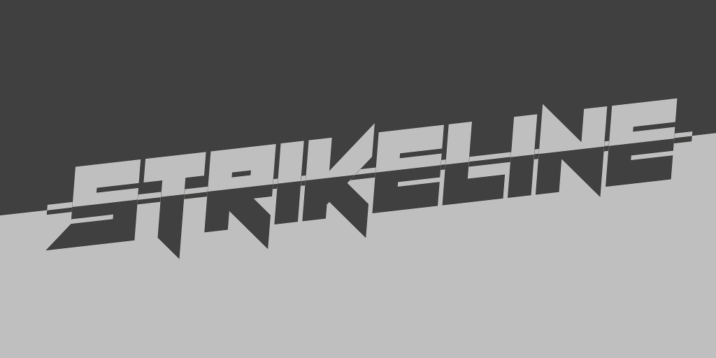
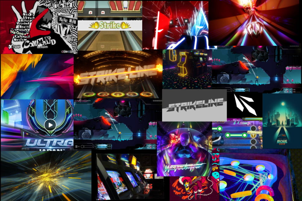
(Please note: These are a number of designs that spawned from a quick brainstorming decision that happened as soon as we decided on the name. As such, they are not representative of the final product but rather a glimpse at the process behind conceptualizing an art direction for the game)
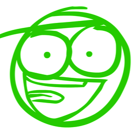
Immediately upon Matt’s suggestion, inspiration was struck and some quick concept sketches were made.
![]()
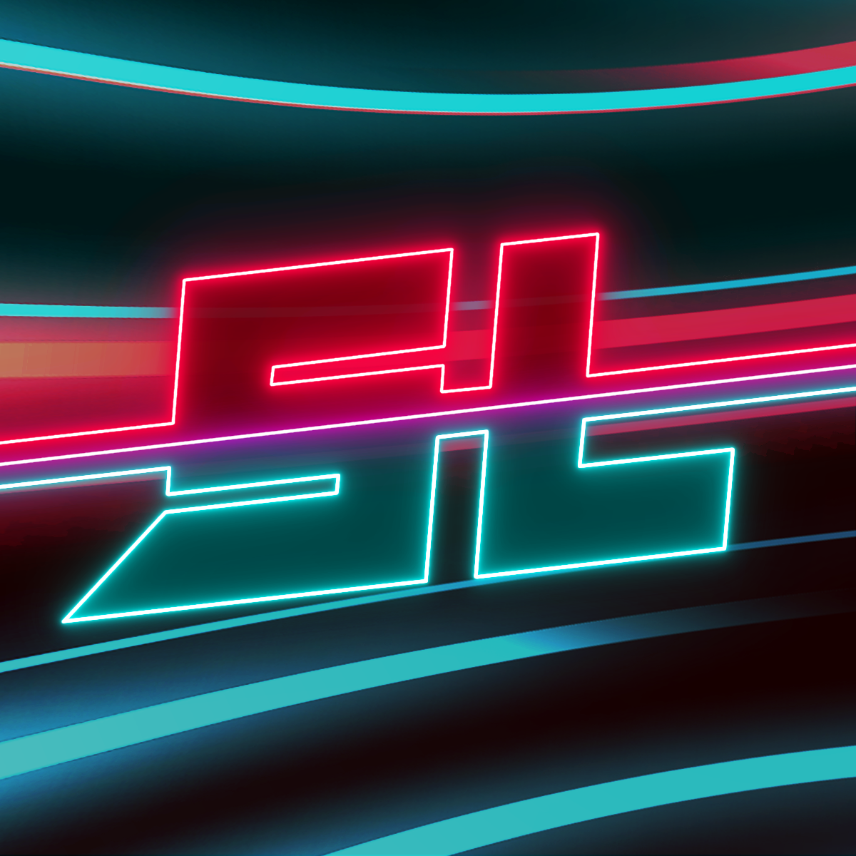
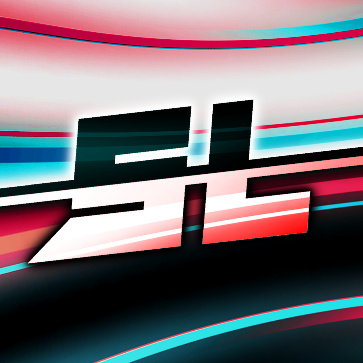
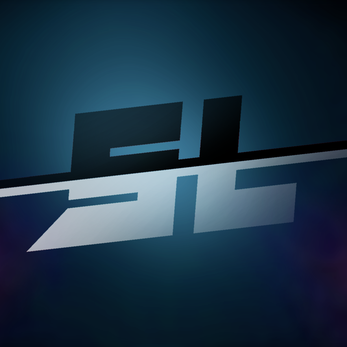
These are me going crazy with glowing colours and designs, because of course I would. Chances are this isn’t what the final icon is going to look like at all, but it’s good during development to draw out rough sketches like these to pump in inspiration to others and potentially lead to the final design later down the line. (Admittedly, that second one is probably a bit too close to Beat Saber and a bit too hard leaning towards my own fascination with glowly lights!)
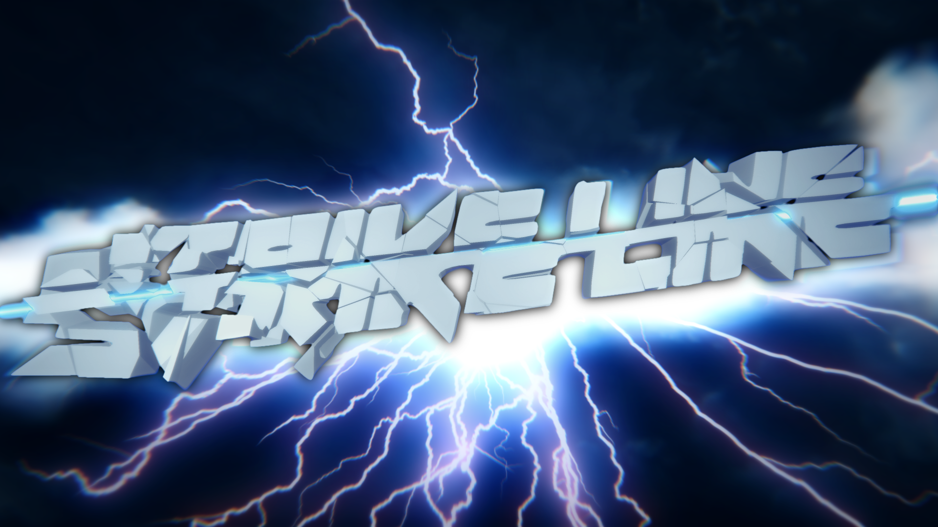
Playing around with designs like these may not seem like a huge priority to those of you who just want to hit notes, but this is a crucial step in design. Experimenting with ideas and solidifying a design to guide our game helps ensure consistent design philosophies and visual presentation. Plus, it looks cool and is fun to do! We are still in the very early stages of deciding on a specific art direction for StrikeLine, though we are hoping that having a peek into our art concepts will give you an idea of what the name StrikeLine sparks in our artists.
Speaking of our artists…
More Than Meets the Eye
Making a game takes a lot of time and effort. And usually, is the result of a lot of collaboration between talented creators. So, much like how last month we introduced you to the brand new community team, this month, I’ll be introducing you to some of our artists, both new and old!
Filyng has been playing games in the Rock Band and Guitar Hero series for years, though he is relatively new to the greater rhythm game community. Starting all the way back in Clone Hero v.04, he was the first artist to join the project. With a talent for clean designs and user-friendly experiences, he’s a visual artist with focus on UX/UI, working mainly on the very same UI overhaul we’ll be showing off down below. Plus he helps us translate the game to Spanish. Is there anything this guy can’t do?
Having played rhythm games since the release of Amplitude, Dima has been active in rhythm gaming communities since the RB1 days of ScoreHero. With a background in interactive multimedia and design, he has a number of projects under his belt, with a few showcasing his passion for rhythm gaming. His skill set encompasses various areas, such as UI/UX, programming, graphic design, animation, 3D, film, and HCI.
Thomas is a 3D Artist who has been playing games in the Guitar Hero series for over a decade. With 9 years experience in 3DS Max and similar software packages, he is currently designing an obscene number of note gems and other highway elements. When the game moves to 100% original assets, you’ll likely have this guy to thank on some level!
Being the second artist to join Clone Hero right behind Filyng, Inventor has been in the game since GH3’s release on the Wii. He made a name for himself after joining the GH3PC community in late 2014 by making custom zones for the community upon request. Though he’s been a tad inactive lately due to school, Inventor is a graphic design major, and has contributed quite a bit to the project!
A Sight for Sore Eyes
The future of CH / PNH’s visuals is exciting, especially since today, many of you will be seeing something brand new for the first time. Our artists have been working hard, and thanks to their amazing output, v0.23 will feature some pretty substantial visual overhauls to the UI of the game.
There were 3 main goals in mind when redesigning the UI:
- More accessibility. The current menu systems are okay, but they can be hard to navigate / feel a bit clunky.
- A more user-friendly experience. This means having proper labels and indicators (e.g. knowing when you’re supposed to strum up/down for options) and more importantly, a push to make the menus support keyboard & mouse inputs natively, to make your browsing experience simpler and easier.
- Implementation of a proper workable UI system. Working a brand new system into the mix that was designed for the UI overhaul gives the team more control over how they want to design menus, and helps future-proof the menu systems to easily implement future menus and/or potential visual changes down the line!
Additionally, having a new menu theme for the future of StrikeLine will help distinguish it from Clone Hero down the line, in order to further form StrikeLine’s own identity as a standalone game, rather than acting as a “clone.”
A Picture is Worth 1000 Words
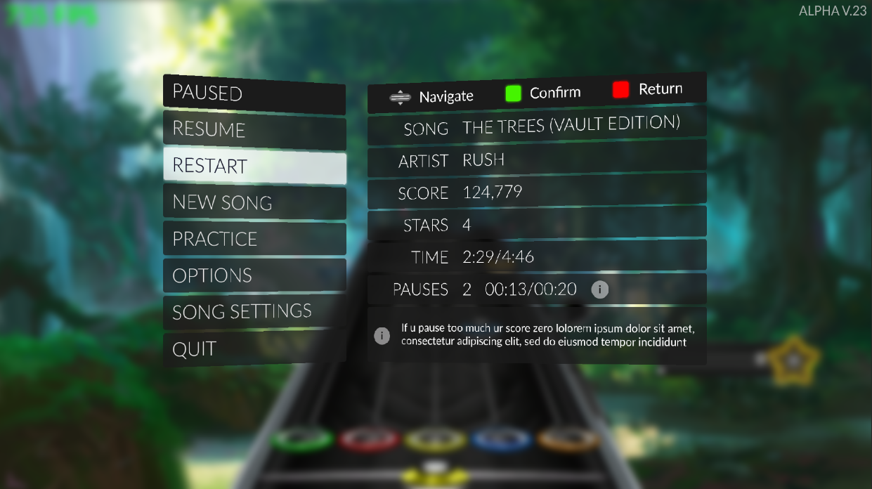
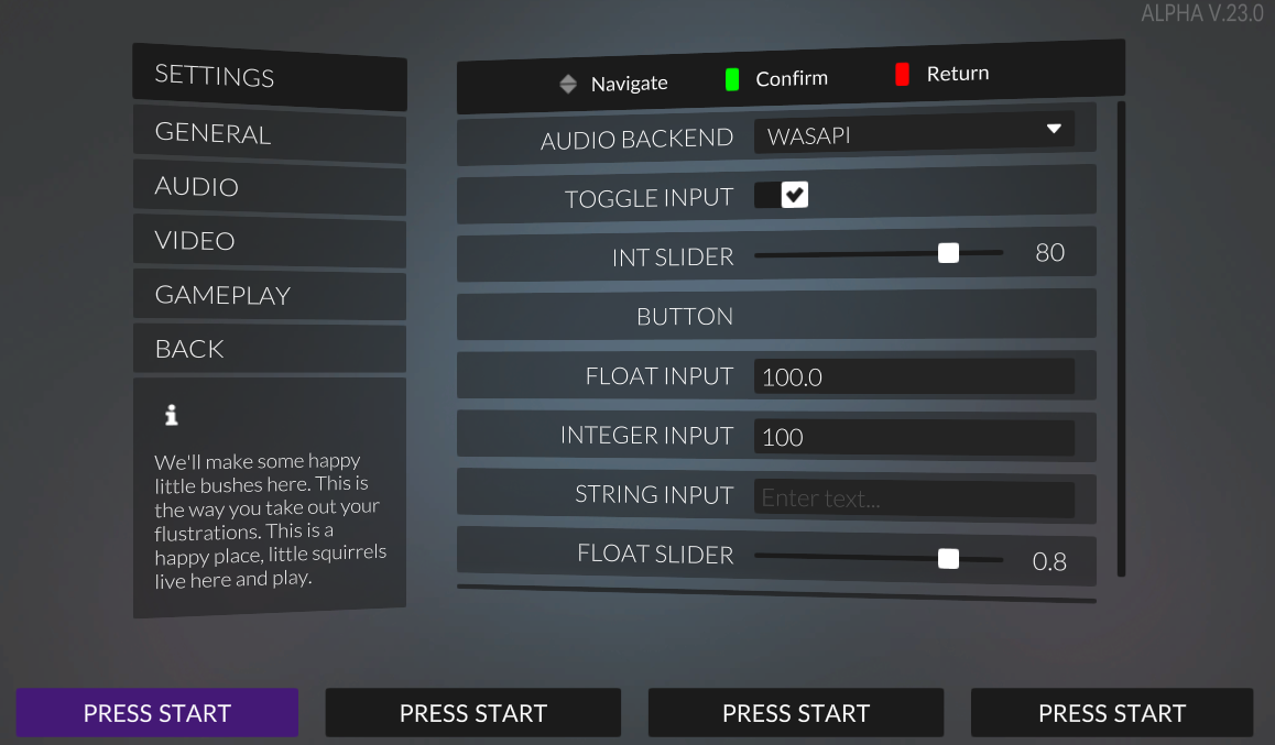
This UI overhaul is really a complete overhaul and not just some slight improvements. As such, the team wanted to break away from the current very basic menu implementation, and create a more uniform, clean, and minimal theme across the entirety of the game’s menus.
In addition to defining some main traits of the UI themes to keep the menus uniform and consistent, it also gave us the opportunity to re-organize some things to improve player flow, while also introducing new features, such as bringing news directly into the game!
It’s good to mention here that these are design mockups, which means that they are subject to change.
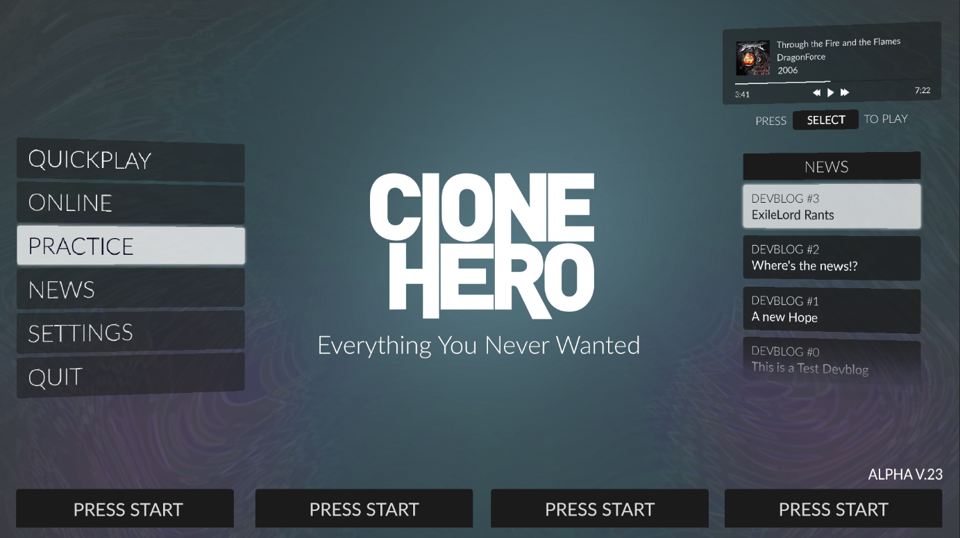
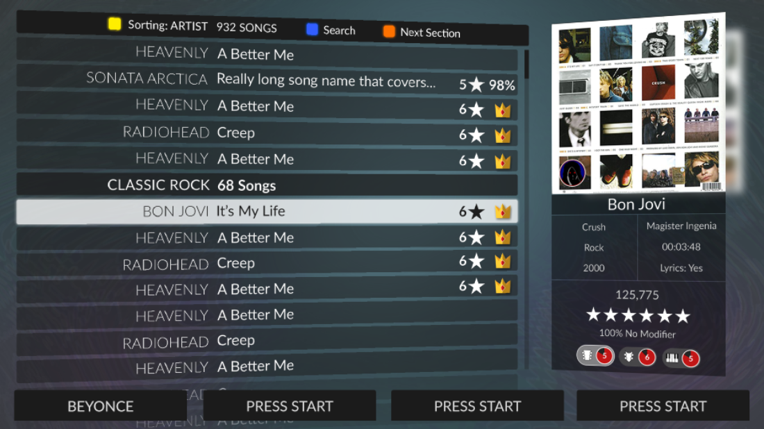
A big objective of this redesign is to bring the UI into a more modern look. By sticking to simple materials, sharp corners, and playing with background blurs, the game will feel more like a modern, polished experience.
A Deeper Look, feat. Dima & Filyng
To take a more detailed look into the design philosophies of the re-design and get a bit more into the thoughts of our artists, I’ve brought in the two guys that are the driving force behind the new UI. Having worked on this for months, Filyng and Dima have drafted concepts, iterated on them, and brought the UX to a whole new level. So, we’ll take this opportunity to hear from them, rather than myself!
We approached this redesign with the goal of making the game more accessible, user-friendly, and more aesthetically pleasing. By re-evaluating each element from the ground up, we were able to decide which form they should take. We did not want to just pick and choose elements from our favorite games, but rather take a deep look into what would be the best way to represent each UI element.
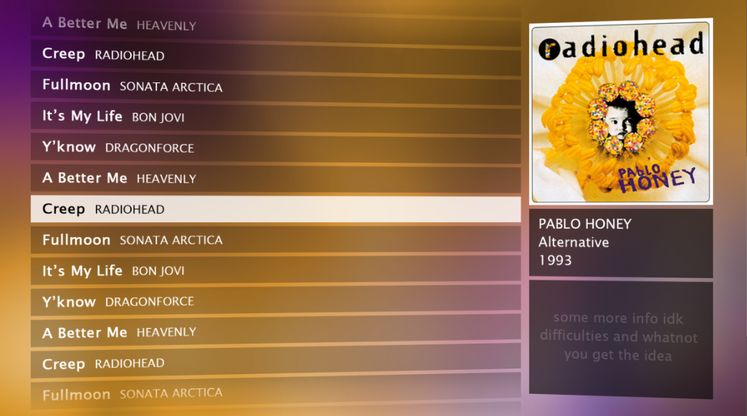
A lot of time was spent on ironing out designs for the song select screen, which acted as a foundation for the rest of the redesign. Many ideas were tossed around, with one created by olmee being used as a starting that lead to the v.23 mock-up.
An asset pack that Filyng found served as inspiration. This inspired the minimalistic style of the UI, as well as stylings such as blurring backgrounds of translucent assets. When paired with olmee’s design, you can begin to see how the final design took form.
We love the idea of having an angled menu because it opens up the door to a lot of animation choices. Where the current version of CH has no menu animation, the angle motif seen in the v.23 designs will be augmented by animations that bring a whole new layer of depth to the UI.
We took great care in making the menu look great with any background. Whether you’re a streamer that keeps backgrounds black, someone that prefers a bright and punchy background, or somewhere in the middle, we made sure that the menus remain contrasted from which ever background you choose.
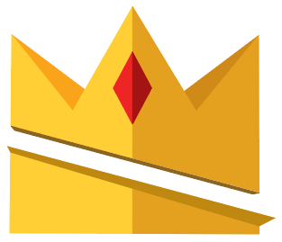
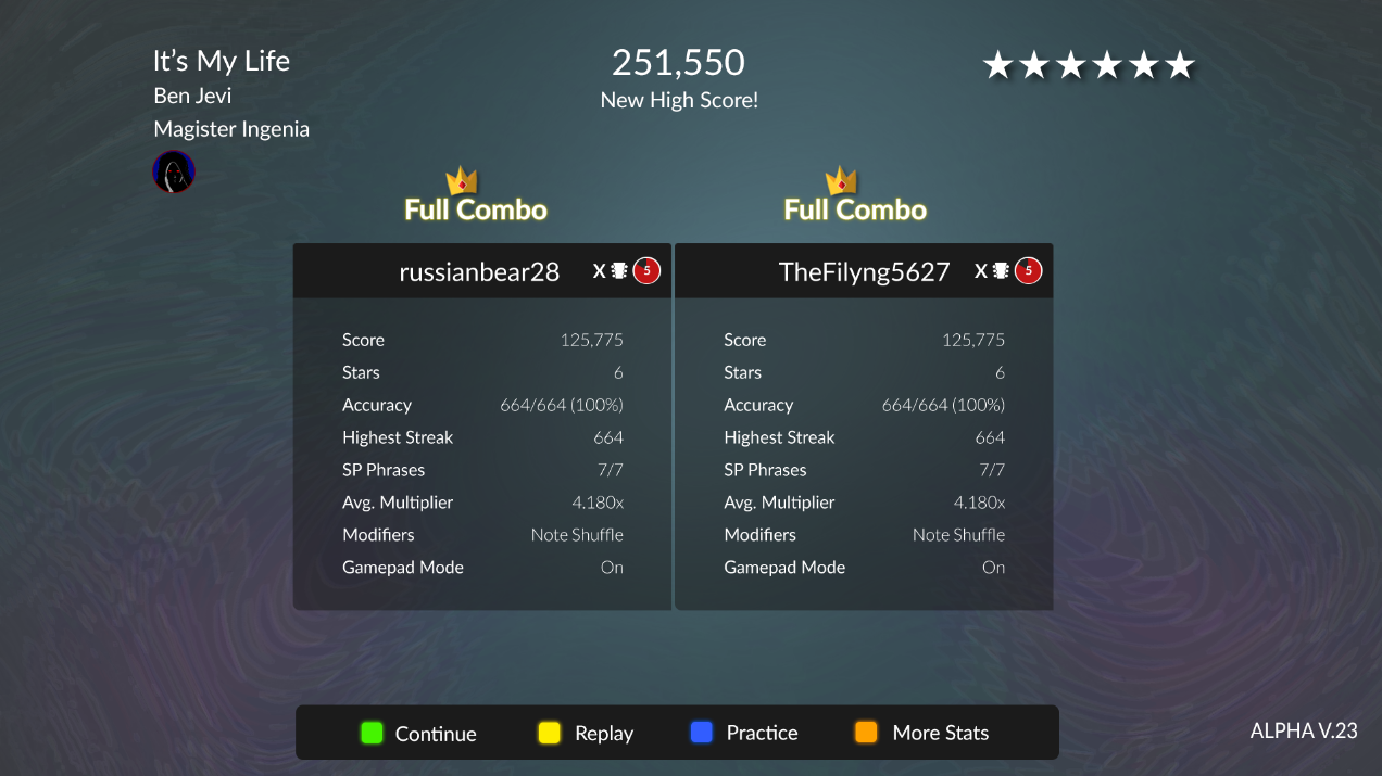
You may be asking, "what’s with the crowns??" Our idea for the crowns was to serve as a symbol of achievement that is more universal than ‘FC.’ Any rhythm gaming veteran can probably tell you they have had to explain what FC stands for on more than a handful of occasions. Although ‘Full Combo’ will still be shown in song results, we think that tying the achievement to a symbol will be more intuitive for newer players. A huge benefit of the crown symbolism is that it opens the door to a whole new language for achievements. Imagine different colors/styles of crowns being tied to different achievements (Gold = FC, Silver = 6 or 7 stars, Diamond = 1st on online, Platinum = FC on all available instruments, etc.) As you could imagine, the sky is the limit here.
Overall, we’re really proud of how this redesign has ended up and we’re even more excited to get in the hands of all CH players. We will iterate on this design based on your feedback and take your suggestions into consideration when we re-brand the game to StrikeLine. We hope that you all like the direction with which we took the redesign. It took a lot of effort to prevent Aren from convincing us to splash bright RGB’s across the menus.
- Dima & Filyng
I already said I wasn’t gonna turn the game into gamer RGB madness smh
Big thanks to those two for joining us in here, though. They’ve put a lot of time and effort, and it’s definitely paying off. I’m certainly excited to see their systems in action, and I hope you’ve enjoyed the more in-depth look into the philosophies of their new designs.
I Want More
We can only give you so much info at once, and this blog was one big beefy boi. We’ll be sure to keep you updated frequently in the future though, don’t you worry!
On the next blog, we’ll be heading into a bit more of the technical details of the game’s future. Outlining Clone Hero’s online capabilities, talking about the potential arrival of public testing builds, the building of new features into the game, as well as a rough road-map for the major goals we’re striving to hit to get StrikeLine into your hands.
Thanks for joining me on this blog <3
~Aren